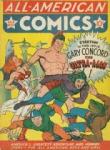
Along with Spider-Man’s debut story, three other Ditko-Lee collaborations appeared in Amazing Fantasy No. 15, including the five-pager “The One and Only!” According to comics collector James Horvath, however, the story was really drawn by his grandmother, Lydia Horvath, a Golden Age artist who spent her career ghosting for bigger names.
Or at least that’s the premise of my novel The Patron Saint of Superheroes. My agent suggested the manuscript include a sample comic book page, so I went in search of an artist who could pretend to be Lydia Horvath pretending to be Steve Ditko. Sean Michael Robinson swooped to my rescue.
And at the risk of revealing myself to be an Alan Moore-level control freak, I think our email correspondence reveals a few things about the collaborative process of writing and drawing comics.
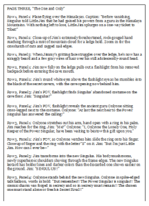
SEAN: Your page from the script you shared looks great– just enough stage direction. My only practical concern with it– Ditko very rarely broke more than 9 panels a page. In fact, in my cursory Ditko flip-through this morning (“Essential Spider-man V 1”, “Steve Ditko Archives” V 1 + 2) I’m seeing the majority of the page breakdowns hovering around 6-7 panels, with a few outliers in the 8-9 range.
Was this actually drawn by Ditko? If not, are there any “tells,” or should it look as much like his work as possible?
CHRIS: It sounds like we were looking at Essential Spider-Man simultaneously this morning. And you’re absolutely right, the panel layout is nothing like Ditko’s—and that’s actually the one “tell” I want the page to have. I’m attaching the PAGE THREE script, which includes the layout. (The gutters form a St. James cross, which is the artist’s secret signature, and a big part of the novel.)
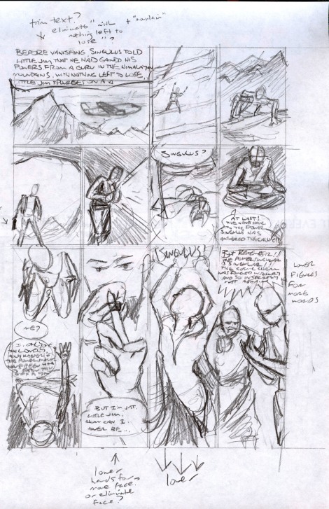
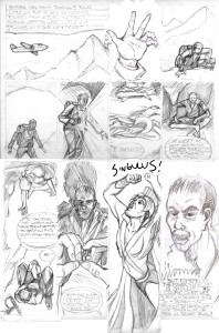
SEAN: Okay, here are two rough (very rough!) layouts. You’ll notice I make a few script suggestions in the margin for the sake of space. Also, I’m not sure how to approach visually the third panel on the 1st tier– substituted a far-off climbing Jim. Feel free to send a sketch my way. Are we seeing just the hand? The top of his head or pack? The view down the cliff face?
Also substituted a close-up for the 1st p 3rd tier– let me know how it strikes you.
CHRIS: Yes to trimming the first caption. So it would now read:
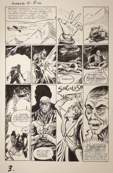
Before vanishing, Singulus told Little Jim that he had gained his powers from a guru in Tibet. Nothing left to lose, Little Jim splurges on a one-way ticket!
For panel 1.2, try a downward view from the very top of the cliff with mostly just Jim’s giant hand reaching up.
1.1, 1.3, 2.1, 2.2 all look good–I especially like how the cave opening worked out. 2.3 and 2.4 look good too, but I’d like to move the talk balloons, so that 2.3’s “Singulus?” is at the bottom of the panel with the balloon arrow pointing to the left gutter (and so Jim in 2.2), and Onlyone’s bubble moves to the top of 2.4. I think that way it will be clearer to see that the flashlight is moving up from the discarded costume to Onlyone, because currently the balloons partly block the partial views of Onlyone’s legs and the costume.
For 3.1, I really like the first version, with Onlyone extending his arm with the ring–but try rotating the panel 180 degrees so Onlyone is at the top and Jim at the bottom. Their dialogue can be reversed so Onlyone speaks first and Jim responds with “Me?”
Yes about lowering the hand on 3.2, so we can see more of Onlyone’s face. Also Jim should slide the ring onto his left ring finger, as he would a wedding ring.
The close-up of Onlyone is good though, so could you place it in the final panel instead? There’s no need for Singulus to appear at all in 3.4. And Onlyone’s emphatic talk bubble can go at the the bottom of the panel, ending the page.
For the big Singulus! 3.3 panel, let his talk bubble punch through the top of the panel into the bottom of 2.3 (which could make a nice effect with the previous “Singulus?”) and let his elbows jut into 3.2 and 3.4. Also, if it’s not already, leave 3.3 unframed.
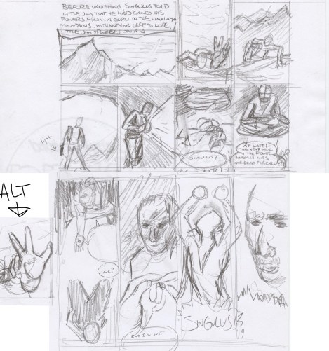
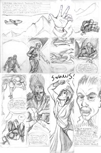
SEAN: Does this work?
Two versions of the 1.3 panel– pls let me know which one is closer.
CHRIS: Go with the alt for 1.2. The bigger the hand the better. It should overwhelm all of the other visual information, so 1.3 then is an answer to the implied questions: what’s going on? where are we?
Good talk bubble flip on 2.3. Flip 2.4 too.
3.1 looks good. Same for 3.2, though maybe make Onlyone a little smaller so 3.4 is more of a revelation.
Nice elbows on 3.3, but I think the “Singulus!” will work better at the top of the panel, especially since the 3.2 and 3.4 talk bubbles are at the bottoms.
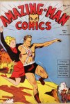
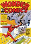
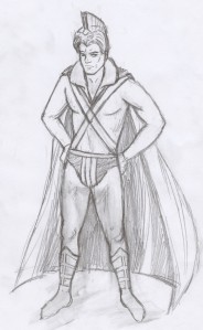
I also attached images for combining into the Singulus costume: Superman’s original boots, Amazing Man’s waist and chest belts, Wonderman’s collar and v-neck, plus standard briefs, long sleeves, no gloves, no cape. (I’m not sure about the Ultraman helmet.)
SEAN: Here’s the promised costume rough (emphasis on rough). Feedback? I have the v-neck and the collar turning into the shoulder of the cape, if it’s not clear. Also added some horizontal stripes in the speedo area. Not sure about that helmet, and the only pics I can find of the character don’t really help in terms of how it’s put together :)
Anyway, all thoughts welcome.
CHRIS: This looks great, Sean. Some possible fine-tunings:
Gloves or wrist bands that match the boots.
And maybe simplify the lines in the chest by having the v of the shirt merge into the v of the criss-crossing belts?
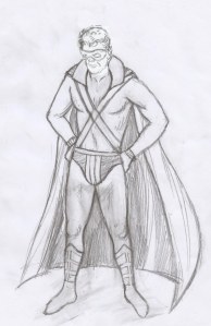
I’m also debating whether the helmet is too much. Maybe instead add a lone ranger mask?
CHRIS: I really love your face, which is lost with the mask, so let’s not have a mask, and you tell me whether you think the helmet works or not.
The wrist bands, briefs and collar all look good.
Should the wrist bands cover the forearms the way the boots cover the calves?
CHRIS: Yes, I can see Ditko coming through in that.
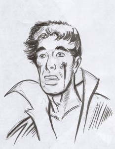
If Singulus’ face is unmasked, young, good-looking, with a full set of hair, Jim should be a bit chubby with a receding hairline.
And keep Onlyone’s body as boney as possible, with almost skeletal arms, definitely a bald head, and a face of ancient raisin-like wrinkles–underneath which is Stan Lee’s face.
SEAN: Three versions here. Thoughts? I’m hoping the rendering will take it into firmer Ditko territory…
CHRIS: Go with Singulus facing left away from the last panel, and with Onlyone’s head larger. Final fine-tunings:
Make Onlyone completely bald and super wrinkly.
Give Jim even more of a gut.
Let the words “Singulus!” burst out of the panel frames in 3.3. His right elbow protrudes into 3.2 well, and so let his left elbow protrude into 3.4 too, maybe slipping slightly behind Onlyone’s head?
To clarify the spatial relationship between 1.3 and 2.1, can you lower the bottom of the cave opening so this becomes the moment that Jim enters the cave? Also, can the same mountain that’s in the background of 1.3 be in the slightly more distant background of 2.1?
SEAN: Okay, here are two versions. I have a strong preference for B, but either one is fine with me!
Things that can be done to make it a bit more “Marvel”:
1. Re-letter this using a font close in style to that decade’s Marvel letters. I can’t get close to that look myself (being left-handed is a big impediment to that, believe it or not :) ) I can look around on some sites if you want me to find a 60’s Marvel copycat font.
2. appropriate artwork stamps on top
3. color “old page” tint to the page (depending on your needs).
CHRIS: I agree that B, with the elbow cut off by the panel frame, looks better, so let’s go with that. And yes also to “old” tint and the artwork stamps. Oh, and can Onlyone be more wrinkled in that final panel close-up? And if you think refonting would look good, go with that too.
SEAN: Here is the finished color file. Thanks again for working with me on this! It was a lot of fun and quite the challenge :)


